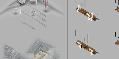
The 'Bench Problem' is something I came up with to get a reading on the way people behave in relation to where others are in a space. I sent out a survey with various seating configurations and a choice of 8 spots people could choose to sit in. The results were very interesting, but for the most part I was not surprised. The majority of people chose to sit in a location where they would not be disturbed, and when that was not possible, they would stand. Some people did not like the idea of sitting on a park bench at all, so they stood for every scenario. From this data, I tried to extrapolate into two different scales: a room, and a city block. The room had tables placed around it, some dirty, some occupied, and some noisy. Based on the results from the bench, I placed most people at the least obtrusive location, while some would choose to sit even if they had to clean up a little mess. The city was a little tougher, as are most urban issues. I attempted to guage the types of people that would visit a particular location in the city: Midtown East and City Hall in this case. Some tourists, some commuters, and some locals just living there. Honestly, at this point it became mostly about making a nice infographic.
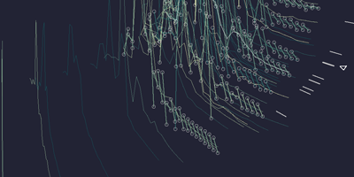
Architectural Drawing + Representation is a class that exposes students to alternative techniques of representing things. The precursor to this drawing (which turned into an infographic of sorts) is a physical machine with gears, a rack and pinion, and a pully that drew lines based off of an input of a tapping foot on a pedal. Because of a minor desigh flaw, it was a loud machine which ironically may have made people more anxious and tap their foor more on it. I took this audio as an input for an analytical drawing created in the algorithmic modeling plug-in for Rhino called Grasshopper. I took samples of a 3D waveform geometry of the audio from the physical machine, and overlayed 5 different layers of analysis on each other. Radially, these curves are organized by average amplitude, or generally just volume. The color signifies when in the audio track each sample came from. The triangles represent general maximums. The short white lines represent consistancy in the waveform, so long periods of similar amplitude. And the exploded samples represent major outliers in frequency and amplitude.
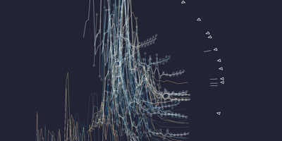
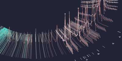
These are two additional examples of the same drawing explained above, but with different audio sources. The one on the left is a conversation between my brothers, so there is a variety of frequencies, tones, and amplitudes at play here.
The one on the right is an artificial audio track that plays a tone of steadily increasing frequency and steadily increasing amplitude. It was mostly as a benchmark from which to explain the project during the review.
The one on the right is an artificial audio track that plays a tone of steadily increasing frequency and steadily increasing amplitude. It was mostly as a benchmark from which to explain the project during the review.

I have been to Paris only three times in my life, but it is definitely my second favorite city in Europe behind Florence of course. I made this map a few years ago, and it's a little bland, I may revisit. It just shows the paris metro lines, but it brought back memories when making it, so it was well worth it.
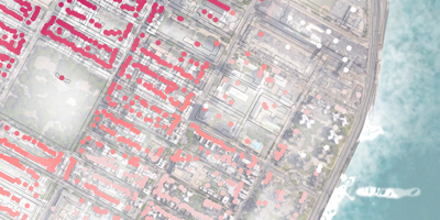
The first L train stop in Manhattan from Brooklyn is quite a popular one for what is around there. In my first semester of graduate architecture school I redesigned the subway station there, looking at the way people interacted with each other and trying to cultivate those interactions and communities through the geometries of my architecture. This diagram show where that particular station pulls from in the area and it;s relationship to nearby parks, neighborhoods, and housing developments, as well as the east river which became the site for the project that followed.
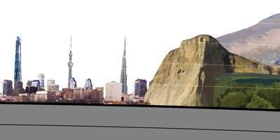
This elevation chart that I created in 2015 (a little dated, but still relavant and nice) shows deep, tall, and significant natural and artificial structures and their relative heights as a section through the earth. I chose to make the vercial scale above ground exponential for representational purposed, it would have been much too small to see the man-made structures at the low end. It is a little confusing at first, but it reads much better than if the scale was linear. And this project was just for fun.
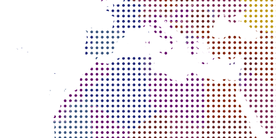
This is simply a world map that I was messing around with when looking at different hatch styles and coloring the countries west to east.
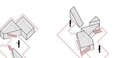
The idea of negative space was very key to my second semester project at Columbia. This is an early diagram of a potential method of considering space by designing the void areas of an interior, the part that people do not end up occupying. The types of spaces these end of creating for the occupants are quite compelling.


